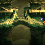
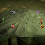
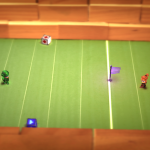
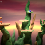
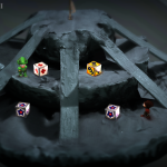
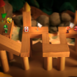
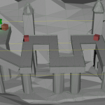
Yeah, I know; I said I was done with levels… But there’s one I just had to revisit: Crag Castle. That’s the goofy one that looks like two mirror-image castles up on pedastals facing each other.
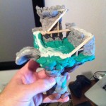
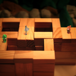
Here’s my simple little model I built for it originally:
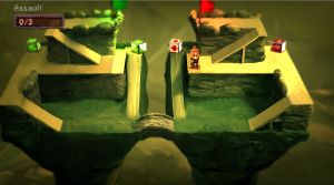
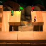
And here’s what it looked like once converted to 3d, mirrored, and added to the game:
 It looks pretty decent from a visual standpoint, but the problem arises when playing on it: all the neat organic lumpy imperfection in the model starts to detract from the fun of the game. Its hard to judge relative positions of things or where bombs will land or how they’ll roll when they hit the ground because everything is so curvy. Its also hard to judge how close to the edge of the level you can get before falling off. Furthermore it feels a bit too large and all the contrast and bumps make it harder to pick out little objects and characters. In general, form has triumphed over function. So with all that against it, despite having spent a fair bit of time on the map, I was about to the point of chucking it in the ol’ virtual trash…
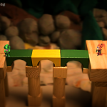
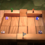
Thankfully I’m stubborn, however, and as it turned out it was nothing a bit of elbow grease and photoshop couldn’t fix. After spending a chunk of my weekend flattening out the 3d version, filling in holes, painting over bumps, and squaring everything up, I’ve got something I’m happy with. The level is now much simpler and feels more natural to play on while still retaining a bit of the appealing organic clay goodness it started with: Hooray; the castle is saved! And now I really *am* done with levels. I swear.

